
Introducing Buster’s Rebirth: there is a new ‘Dawg in town
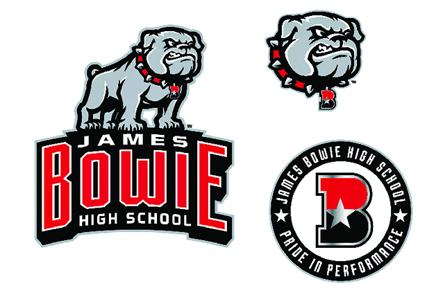
Pictured above are the new designs owned by James Bowie High School.
October 6, 2018
If you’ve seen the new Bowie logo you’ve noticed that it doesn’t look anything like it did last year. Last year Bowie was sued by Gonzaga University because we were using their copyrighted logo, and that meant that we had to give our mascot Buster the Bulldawg a makeover.
Do I think that the lawsuit was needed or warranted? No, but it ended it up having a good outcome. The lawsuit against us didn’t seem like a positive thing at first. In fact, it was a pretty big and costly mess, but it gave us an opportunity to create our own logo that is ours, and only for us to use.
This is not the first logo that Bowie has stolen either, over the years we have used many mascots that aren’t ours and gotten away with it, but this time we couldn’t get away home free.
The lettering on the logo is probably the aspect that I love the most about the new design. I enjoy how the white “James” on the top fits snugly between the “B” and the “E”, and how the “High School” fits nicely on the bottom. I also enjoy the font and color that they chose because it creates a classic varsity sports look, and the white outlining on the red letters ties in the white lettering on the top and bottom.
The whole thing looks really clean with the black and gray outlining and gives it a polished but modern look. I also like how Buster is standing on top of the words and has the same outlining as the letters because it gives it a uniformed style and makes it look like they belong together.
In the new design for the bulldog, he is showing off a snarl while wearing a spiked red collar with the Bowie “B”. I do wish though that the star in the Bowie “B” on the collar was white instead of gray. The full body style is more intimidating in my opinion and adds bulk to the logo instead of it just being a floating head. I also feel like the logo was tastefully made and the angle that it’s coming at adds more to the appeal of it.
The logo was designed by Varsity Brands, a company that focuses on re-branding and redesigning logos for schools. A committee of teachers and department heads from band, football, and other activities around the school communicated back and forth with the company to give us the look and feel that Bowie needed.
All in all, the new logo design is polished, clean, modern and most importantly, we own the copyright so it’s ours and only ours to use indefinitely.


Richard Mitchell • Oct 29, 2018 at 8:13 pm
Love the new artwork!
I’m a parent in the Bowie OPE Band Boosters club and wondering how I can get a copy of the artwork and logo in Adobe Illustrator format for a video slideshow project I’m putting together. We’re trying to make a video using Adobe After Effects in celebration of the band’s recent achievements making the UIL Area finals which allows them to go to state next week.
Please let me know how to best proceed.